
Three views show the same bookings, each from a different angle: your own bookings, those of your colleagues, the free places per resource. You switch via the tab row directly below the top bar – My workplace, Employee overview, Workplace overview. The data behind them is always the same; a single booking appears in all three views, just shown differently each time.
My workplace
Your personal bookings as a weekly calendar. For each day you see what you have booked – desk, office, parking space, home office.
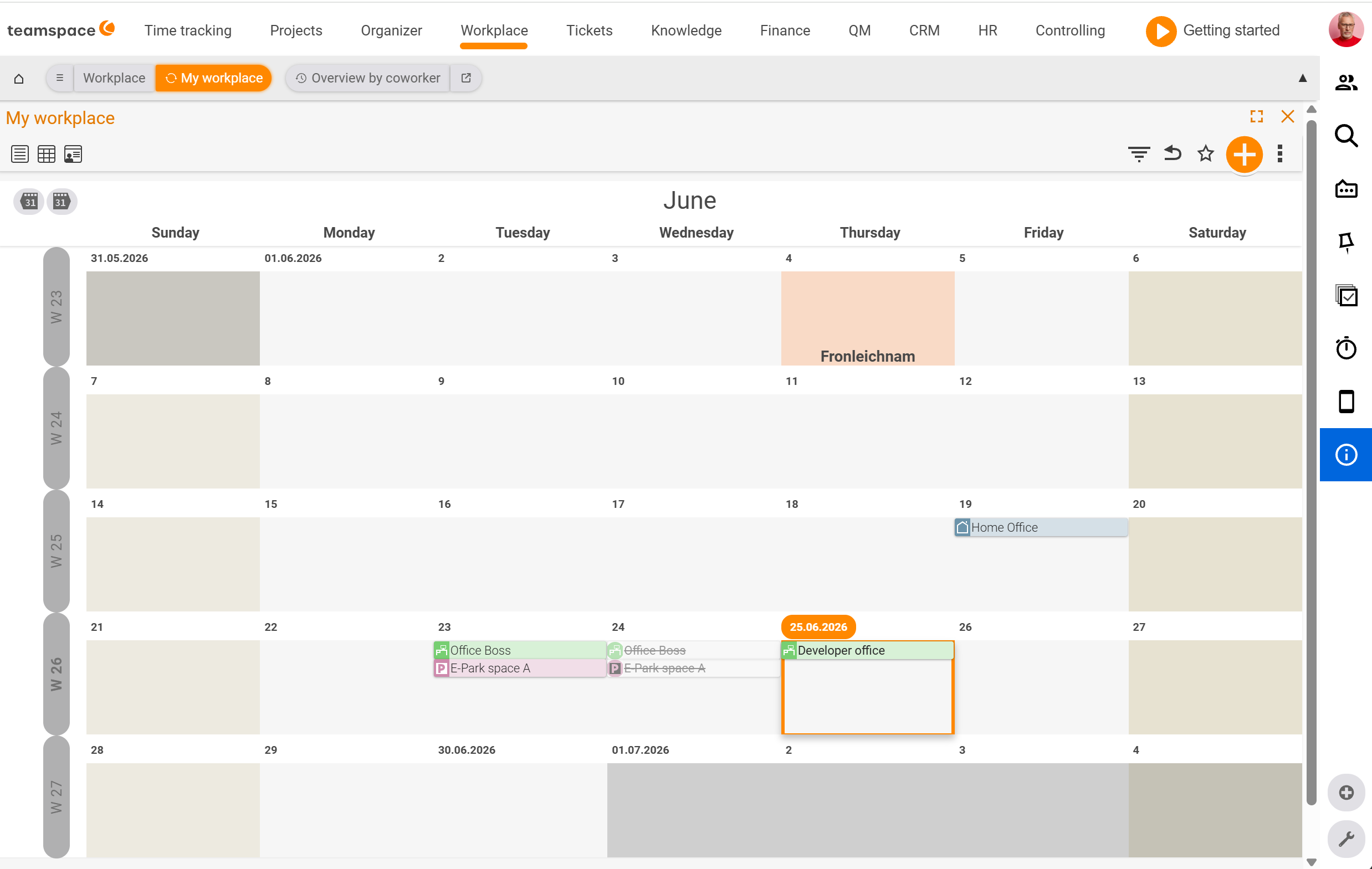
The layout is a month grid with the seven weekdays as columns and the calendar weeks as rows (CW 18, CW 19 …). Public holidays are shaded in colour and labelled by name – for example May Day, Ascension Day, Whit Monday. Today carries a blue date badge in the top left and a blue border.
Using the view icons on the left of the toolbar you switch between Standard (weekly calendar), Month view and Availability. You create a booking by clicking on the day and choosing the resource in the New booking dialog – details on this in Book a desk or parking space.
This view is the default entry view: this is where your own day-to-day activity happens.
Employee overview
Your colleagues’ bookings as a timeline – one row per employee, one column per day.
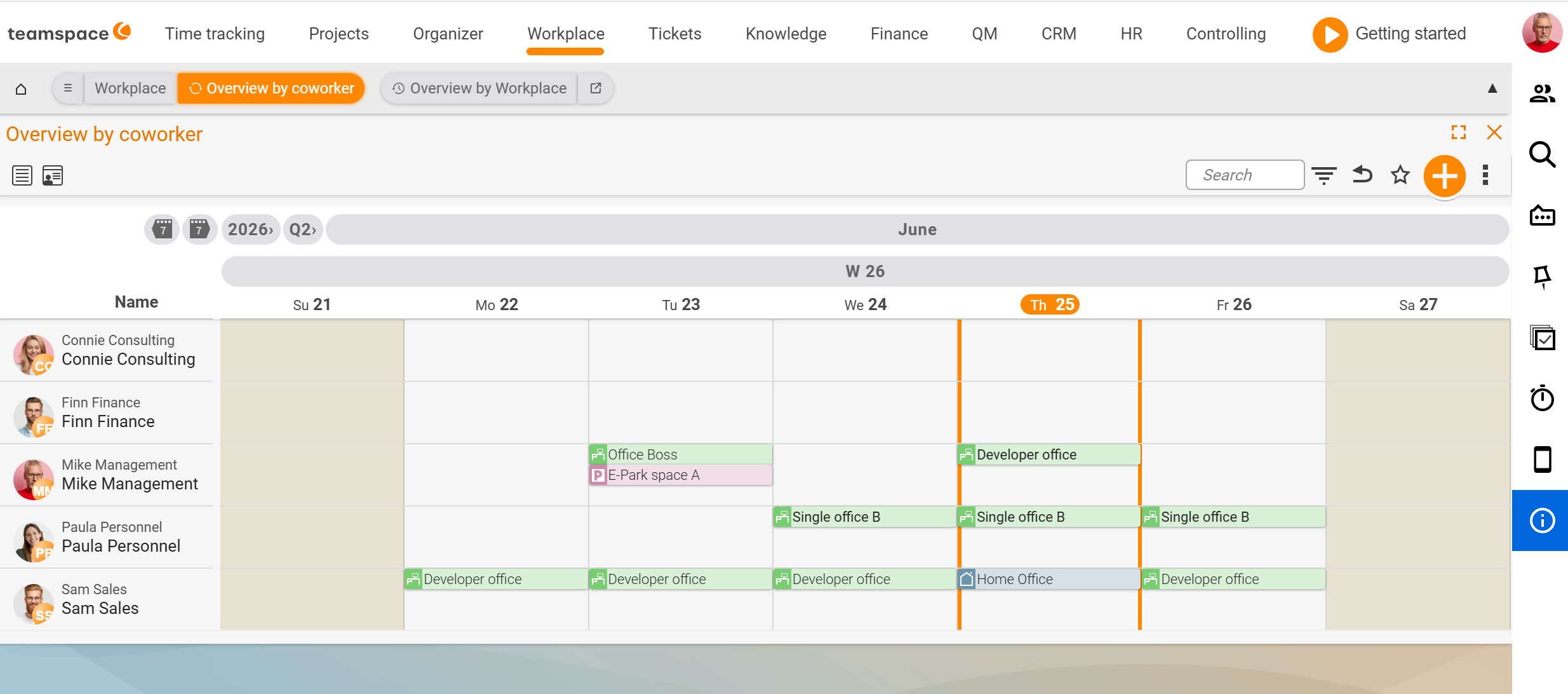
In the cells, the bookings appear as horizontal stripes. The colour reflects the category of the resource – open-plan, single office, parking space and home office each have their own colour. You can tell at a glance who is on site and when, and who is working from home.
Using the Search field in the toolbar you narrow down to individual employees, and using the filter icon to groups or date ranges. The date selector with <Year>/<Quarter> drop-downs moves the visible window forwards or backwards.
This view helps when you want to know when colleagues are reachable, or when you are coordinating a meeting in the office. If it is not about “who is there” but about a fixed appointment, that tends to run through the Calendar instead.
Workplace overview
The free places per resource as a timeline – one row per resource, one column per day with the number of places still available.
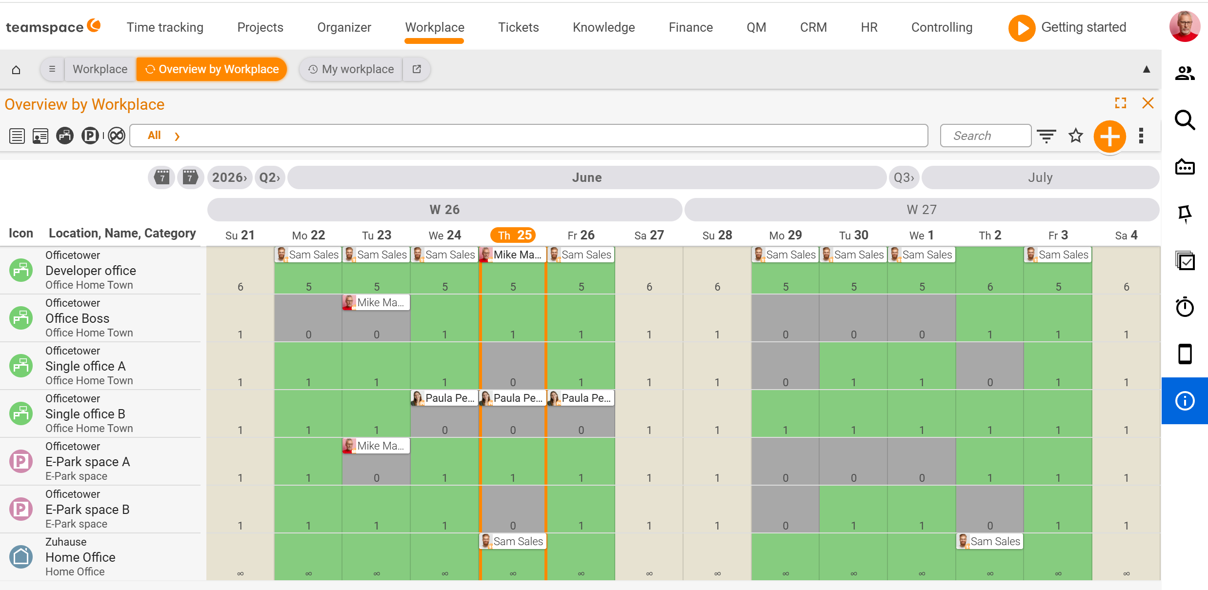
Each resource shows three details on the left: an icon (green A for office, red P for parking, house for home office), then location, name and category – in the demo for example Office tower / Executive office / Office Digitalstadt or EV parking / EV parking A. The number in the day cells is the remaining capacity: for a single office at most 1, for a developer office with six places at most 6. Green cells mean free, beige cells are weekends or public holidays, pink/orange mark public holidays with a booking block.
Using the All filter drop-down in the toolbar you narrow down to one category – for example only parking spaces or only single offices. What lies behind the categories and the four resource fields is covered in Set up categories and resources.
You need this view when your bottleneck is the resource: a free office for a workshop week, an EV parking space for the day on site, a second single office alongside the one already booked.
Which view for which question
- “I need a place tomorrow.” →
My workplace. Click the day, book, done. - “Who is in the office on Thursday?” →
Employee overview. Read the column for the day. - “Is a single office still free next week?” →
Workplace overview. Read the row, check the remaining capacity.
They remain three angles on the same data: a booking that appears as a block in My workplace shows up in the Employee overview as a coloured stripe and in the Workplace overview as reduced remaining capacity.
Filters, search and default setting
Each of the three views follows the same toolbar logic, with small differences per tab:
- Search text field (in
Employee overviewandWorkplace overview) – narrows down the visible rows. - Filter icon opens the
Settings and filtersdialog with theViewandFiltersections (date range, employee status, category). If a filter is active, the date range appears to the right of the filter entry. - Date selector with
<Year>/<Quarter>drop-downs moves the period. - Star icon saves your current filter and view setting as the default for the view (tooltip
Save bookmark / default setting).
Who sees which filter and default options depends on permissions: admins have access to module-wide settings, ordinary employees only to their own bookmarks. See Topic: Permissions.
Common questions & needs
| You want to … | How to |
|---|---|
| Quickly book a place yourself | Open My workplace, click on the day – see Book a desk or parking space. |
| See who is in the office on Thursday | Employee overview, read the day column; colour = category of the resource. |
| Find a free single office for next week | Workplace overview, read the category row, check the remaining capacity. |
| Show only parking spaces | In the Workplace overview, set the All filter drop-down to the parking category. |
| Filter out a specific colleague | In the Employee overview, type the name into the Search field. |
| Keep your filters permanently | Set the filter/view and save it as the default via the star icon. |
Related topics
- Workplace – introduction Workplace Introduction
- Book a desk or parking space Workplace How-to
- Set up categories and resources Workplace Configuration
- Topic: Calendar Calendar