

Since 2025, teamspace has run on the revamped “Genua” interface. The motto: turn familiar usage into better operation. The goal was more clarity and more efficiency – tidy and simple, even though there are still a great many functions under the hood. The name comes from sailing: a genoa is a large foresail that makes things go a little faster and a little better.
For existing customers – don’t worry: the first impression isn’t dramatically different. What worked well has been kept, and new operating concepts have been added. After a short period of getting used to it, you’ll work faster. The concepts shown here are the same as in Working with lists and The 3 key interface elements – just newly tidied up.
Tidied-up lists
All lists now contain several display modes (the icons at the top):
- The first display is deliberately pared down and is meant purely for selection – you are no longer overwhelmed by too much data.
- The detail list works well as a basis for evaluations.
- Plus a tile view and statistics. For both, click the active icon again to adjust them (size, split, displayed values).
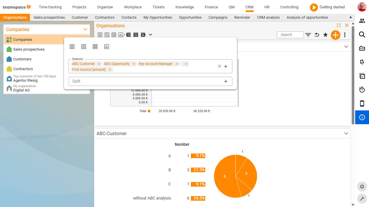
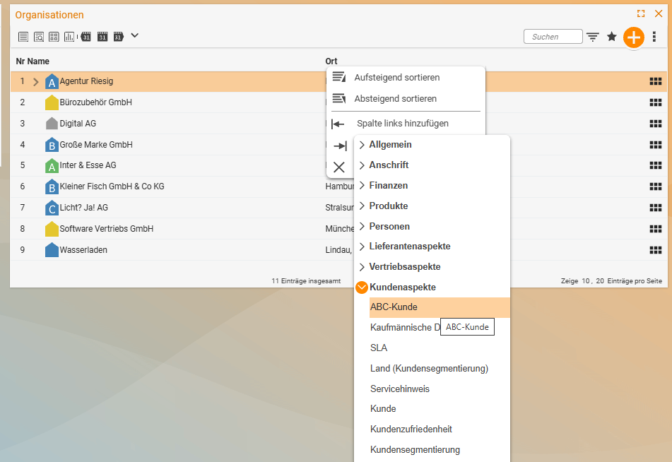
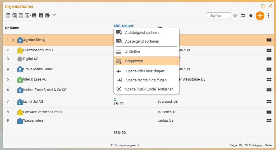
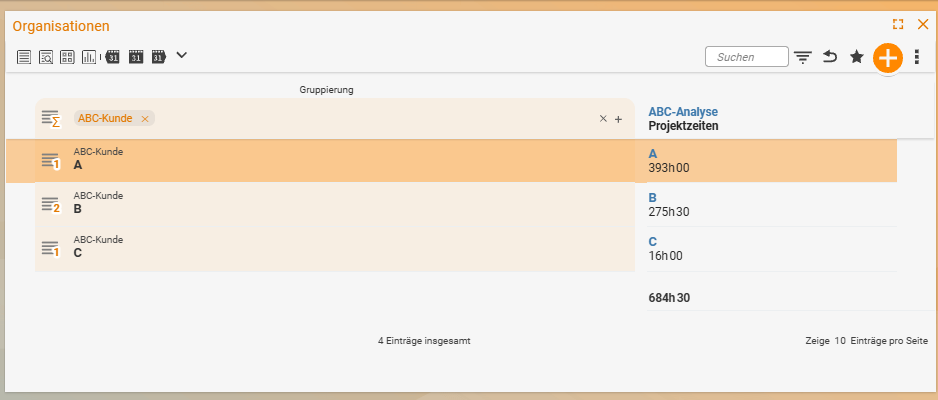
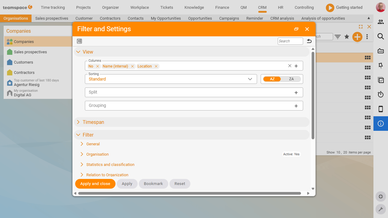
Columns and grouping
To add a column, go to a field and insert the column you want next to it – it appears immediately. If a field is groupable, click it and teamspace forms groups (e.g. by organisation size) and automatically aggregates all addable values into a sum. Another click removes the grouping; in the same way, the list can be split. You’ll find the same view settings – columns, sorting, split and grouping – bundled together in the Settings and filters dialog (funnel symbol at the top right).
New filter area
The filter area has a clear structure: the view area at the top, the time-range area below it (all time filters bundled together), and the content-sorted filters below that. Best of all, active filters are shown directly in the row – so you can see at a glance what is applied. A search field lets you find filters as you type, a toggle icon expands or collapses everything, and another symbol restores the original state.
Editing directly in lists
List entries can now be edited directly, without first switching to the detail manager – always within your permissions.
Remembered elements
A powerful tool: using multiple selection, you remember elements (add / remove / set) and then filter on them in another list (search field RM). This lets you answer questions like “Which products have we sold to exactly these three organisations?” Details in Working with lists.
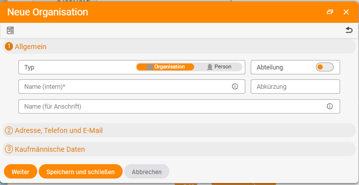
Wizard dialogs when creating
Creation dialogs now feel like a wizard: instead of showing all fields at once, you work through steps (1 – 2 – 3, and more depending on the dialog). The input fields are subtly animated, and the duplicate check warns you even as you type (e.g. if an organisation already exists) – it can also be switched off per dialog.
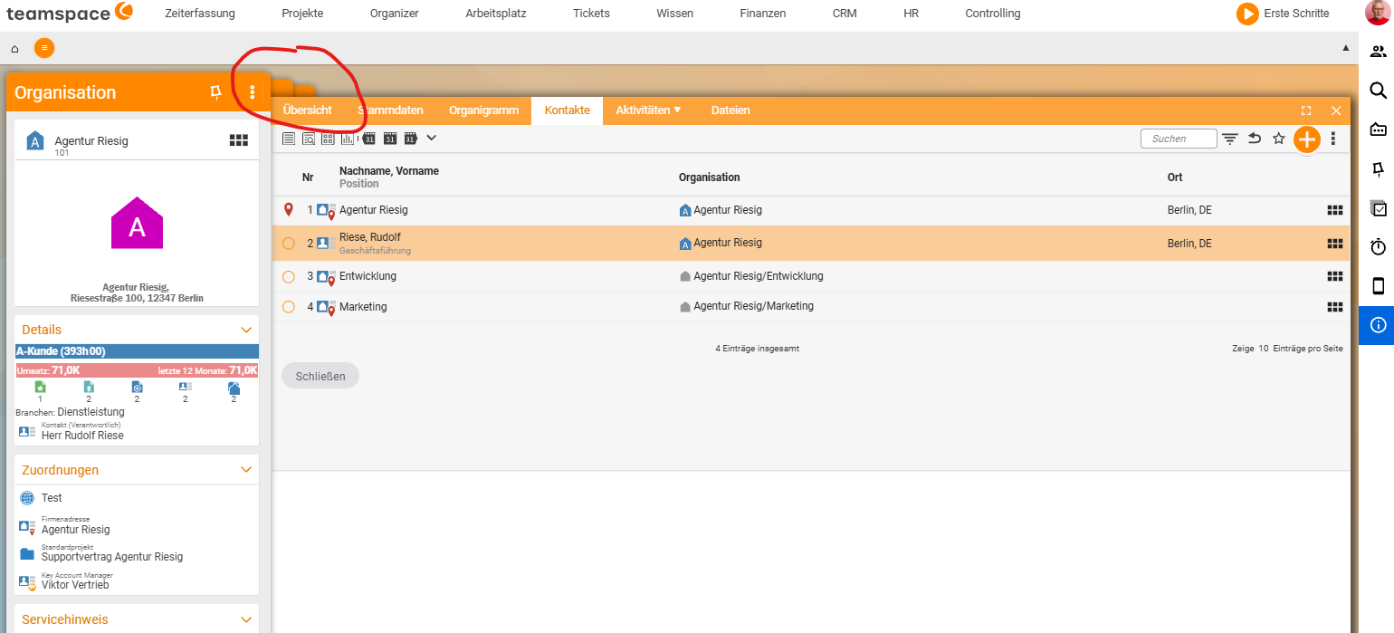
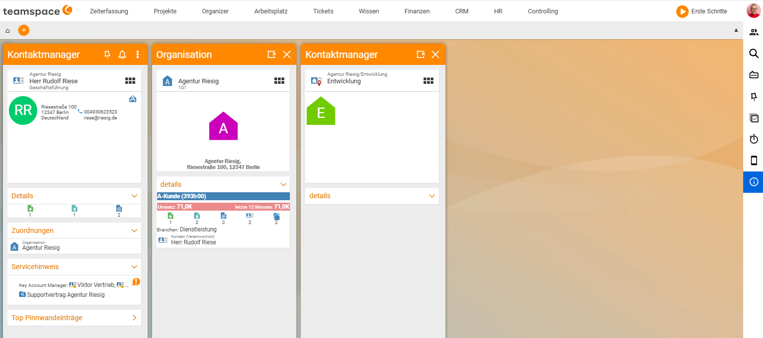
Several detail managers side by side
When you open another element from within a detail manager, teamspace places it in front – the previous ones remain as a stack in the background. By clicking the header (or the corners of the stack) – provided the screen is wide enough – you can fan them all out side by side (like a dashboard), switch to a specific one, or enlarge the right-hand side to hide the left. You can nest them to any depth.
The two former project detail managers have also been merged into one that shows structures and details.
Tidied-up dialogs and layout levels
The master-data dialogs are content-sorted, with the most important aspects brought to the fore (e.g. payment method, main address). You change fields directly in the dialog (find the field → change it → save).
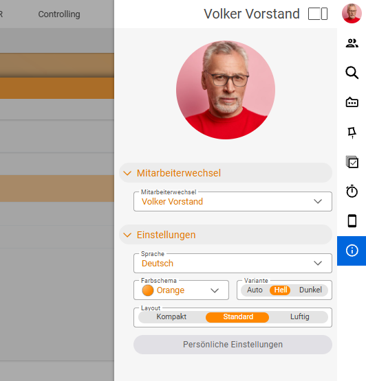
How densely everything is displayed is up to you: via your profile picture, you choose under Layout between compact, standard and airy. In compact mode, you see much more at once.
Notes
- Effort & scope: more than 600 dialogs were tidied up, along with countless lists – sorted by content, not just automatically.
- Faster: the new interface loads around 50% faster than the old one.
- Nothing to relearn: the list, detail manager and action box still work as before – Genua simply makes them clearer.